

Restricted Frequency #152
1.
This week I expose you to some of the wonderful process stuff I’ve been contending with on pages for THE SOLAR GRID. In particular, color stuff.
“B-but I thought THE SOLAR GRID was a black and white book.”
Yes, yes, you’re mostly correct, it is largely a black and white book, except for my extraterrestrial scenes. Which we only begin to see in Chapter 5.
Like, for example:
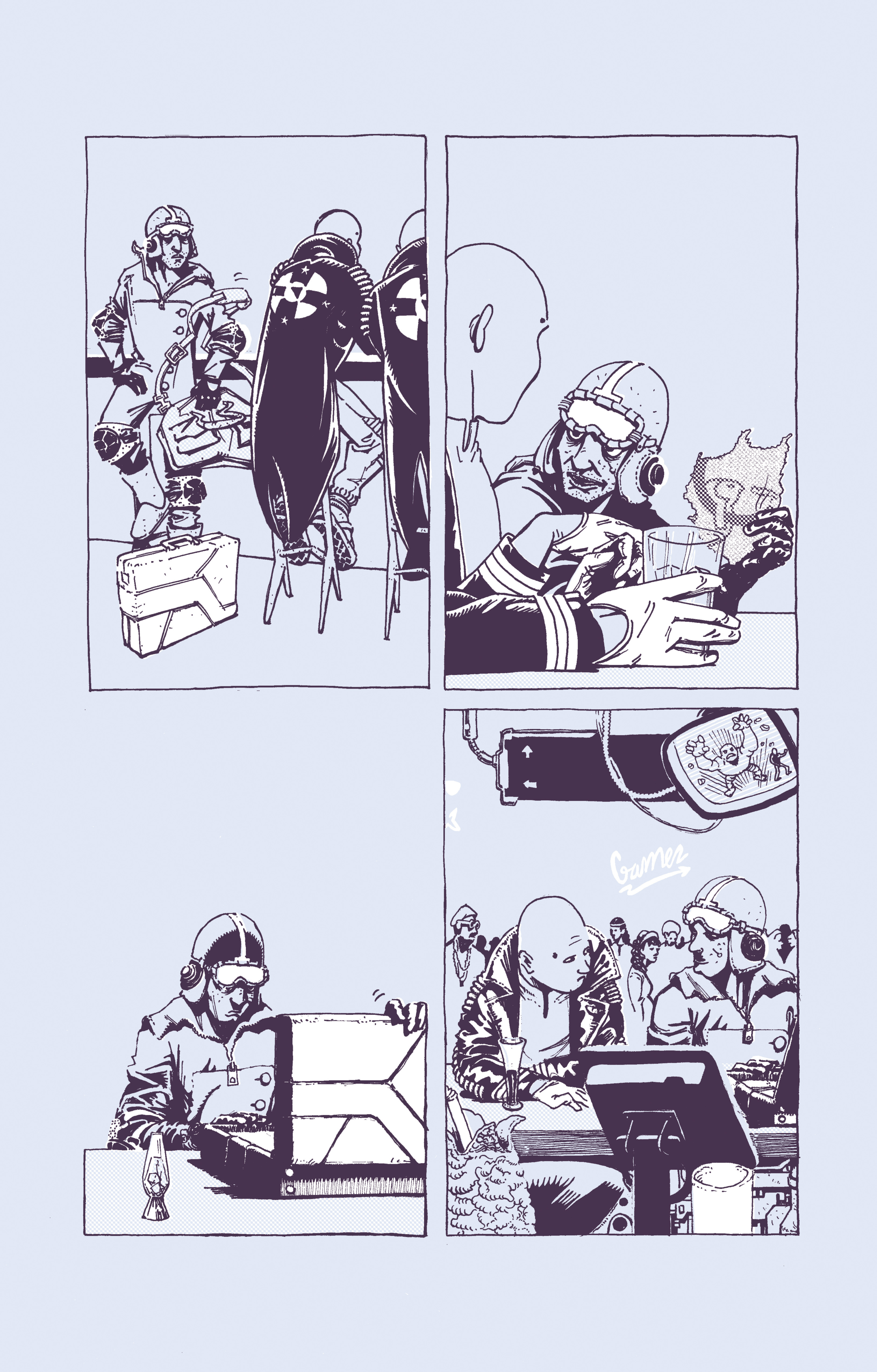
My first instinct was to print straight black on metallic paper, but then it became clear that the glare created by the paper wouldn’t make for a comfortable reading experience. On top of the production issues that would arise from mixing paper stocks, so I instead resorted to coming up with a color palette that would evoke the “mood” I wanted, a kind of serene moon-ness.
The white highlights? I actually block them out manually on a separate sheet of paper:
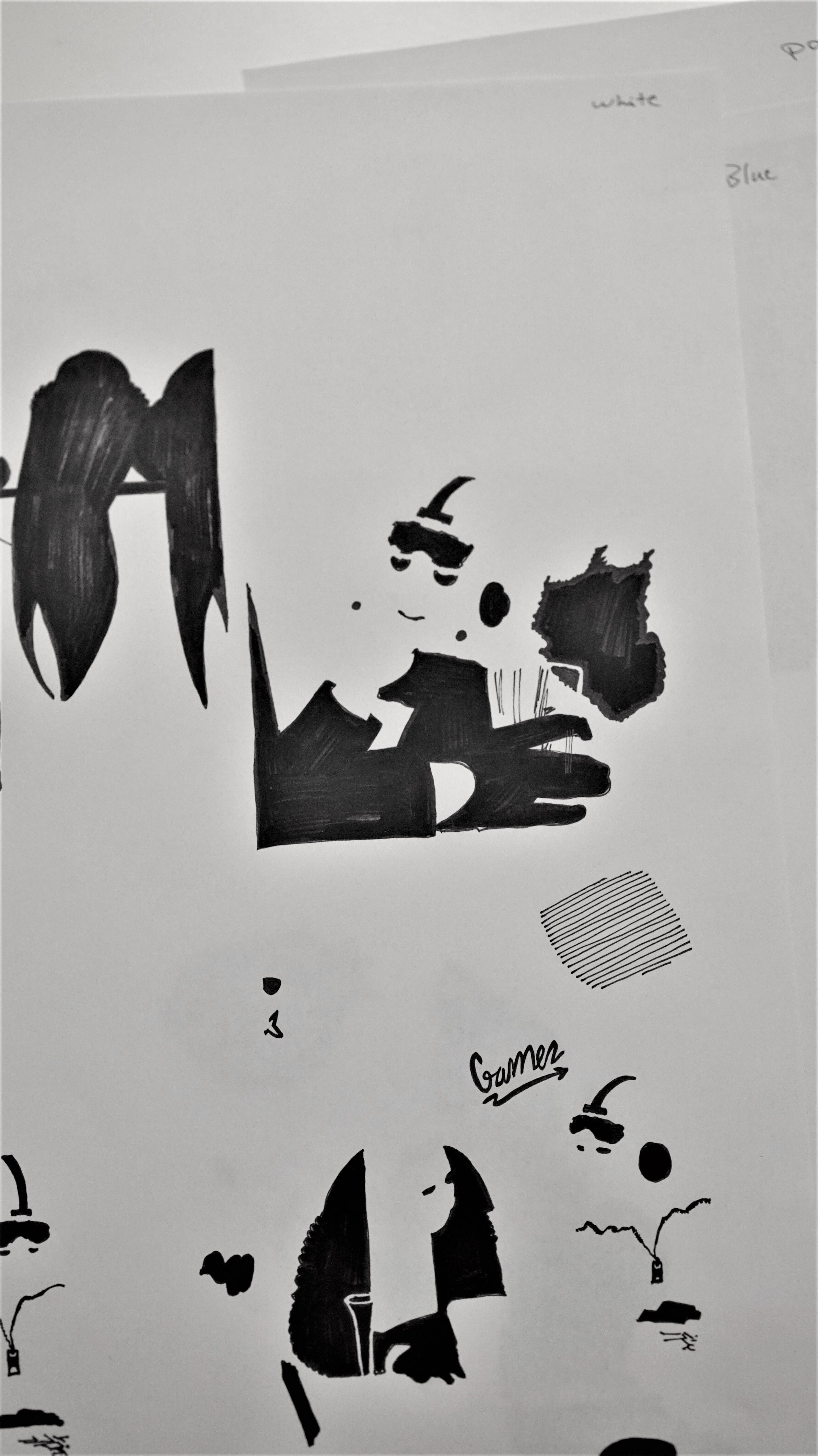
I scan that in, place as a layer under my line art in Photoshop and just replace the black with white. A bit of a roundabout solution I had to come up with after my Surface Pen stopped working (Which kinda makes the Surface Book in its entirety kind of pointless, doesn’t it? I might as well just work on a traditional laptop).
At least this method is troubleshoot-free.
Thing is though, this method gets sliiiiightly more laborious with my Mars scenes…
2.
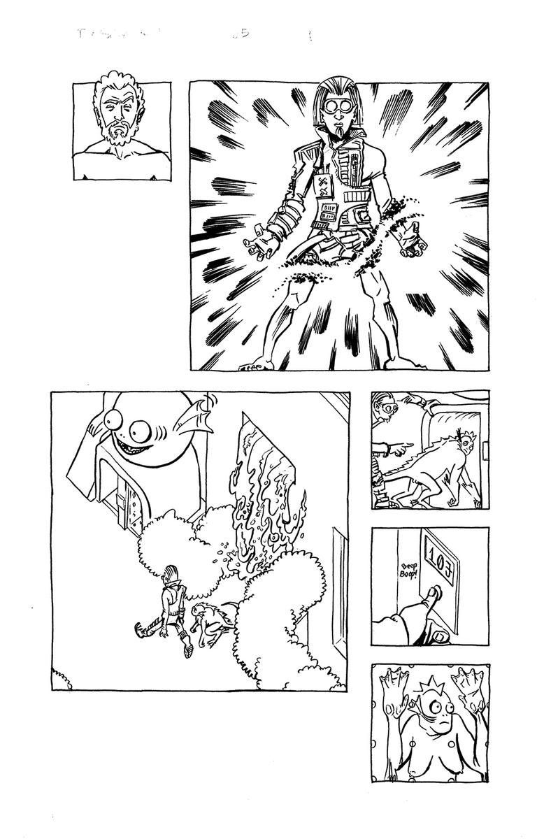
I need about six different color layers for my Mars scenes, which means 6 different sheets of color blocks per page. Example:

The process does force you to examine your pages in an incredibly reduced way though, to see… how balanced/iconic they are in a sense.
Once you’re done with all your layers, you scan them in and assign the appropriate color to each, like such:
People on my Mars are only able to cope by way of an intricate augmented/virtual interface that dominates their cities, transforming them from dull structures to vivid, exciting environments. Hence, the bizarre color scheme that makes it look all too unreal.
You might’ve noticed that in my moon sequence way at the top, I abide by a strict 4-panel grid. This evokes a kind of sameness that I felt would work to depict the monotonous passage of time on the moon, or lack there of. It takes 27 days for the moon to make a full rotation around its own axis, which means the passage of time there isn’t anything like on Earth.
A Martian day is akin to an Earth day, with the red planet rotating around its axis in 24.6 hours. But, the artificiality of the augmented interface would create a different sense of sameness. Instead of a grid, I expressed this by making all panels square. This applies to all scenes that take place on Mars.
3.
You might be wondering about the wide gutters and excessive amount of white space on my Mars page up there. Well, another thing the interface does is that it keeps people plugged into the media and each other. So imagine a constant stream of other peoples’ thoughts and dialogue in addition to ads and news and “television” directly into your mind. I had to figure out a way to express that without it getting in the way of the actual story, the actual events at hand. Figured I’d make use of the gutters.
That’s the bit I’m working on now; all the material that will run between and around the panels in my Mars sequences. Stuff that is, quite frankly, inconsequential to the “plot” yet integral to the world-building. It might make the pages dense, but my solution is to keep it all in black and white. Against the vibrant colors used within our main panels, none of this “backstream” stuff should get in the way of the intended reading experience.
That’s the idea anyway.
At 20 pages, this is actually my shortest chapter to date (Chapter 4 was over 80!), but—paradoxically—it may also be my densest.
The actual lineart (pencils+inks) I was able to complete at a rate of about a page per day, but the colors, letters, and additional backstream art are all adding to the workload. Keeping my fingers crossed for a late June finish date on this one. 💪
4.
Restricted Radar:
Jim Rugg and Ed Piskor run the best comix-related Youtube channel in existence, but at the very top of their episodes I would recommend their 3-hour and 43 minute conversation with Steve Bissette, followed by their interview with Brendan McCarthy, and also… Tim Truman!
Comic Book Plus: great archive of comic books that have fallen into the public domain.
Simon Stalenhag creates beautiful “mundane” sci-fi imagery (discovered via Gustavius at Restricted.Academy).
Square Eyes by Anna Mill and Luke Jones was brought to my attention for like… the third time in 12 months, so I think it must be terribly good. Added to my to-buy list.
That is all for this week. Be well,
Ganzeer
May 16, 2020
Houston, TX